Best Online Chart Makers in 2026
Evaluating the top online chart makers in 2026, detailing their features, pros and cons, ideal use cases, and pricing information.


The Best Online Chart Makers for 2026
This guide compares the top online chart-making tools available in 2026, based on their features, pricing and ease of use. It covers tools suited to journalists working on a deadline, marketers building charts for social media, and anyone who needs to turn a spreadsheet into a clear chart.
What’s Changed in 2026?
Chart makers have improved significantly in the past few years. Many tools now suggest chart types automatically based on your data, real-time collaboration is standard, and most tools run entirely in the browser.
Several of the tools in this guide changed their names, plans, or pricing during 2026:
- Google Data Studio: In April 2026 Google renamed Looker Studio back to Data Studio. Existing reports and links carry over, and a paid Data Studio Pro tier serves teams that need governance and AI features.
- Datawrapper: In July 2026 Datawrapper added individual Pro ($21 per user per month) and Business ($39 per user per month) plans. Paid plans previously started at 10 user accounts, so a single person can now remove the attribution and export SVG or PDF files.
- Google Sheets: Gemini in Google Sheets can build charts, pivot tables, and formatted tables from a text prompt on eligible Google Workspace and Google AI plans.
- Canva and Flourish: Canva Sheets includes Magic Charts that stay in sync with your spreadsheet data, and Flourish is available inside Canva Business through its Presenter plan.
- InstaCharts: Dashboards combine charts, data tables, KPI widgets, and text widgets from multiple sheets on one live page.
2026 Comparison Table: At a Glance
TLDR: We’ve summarized a few key data points below for easy viewing:
| Chart Maker | Pricing | Charting Ease | Primary Use Case | Live Sync | Focus | Data Transforms | Private Free Tier |
|---|---|---|---|---|---|---|---|
| Tableau Public | Free, $$$$ | Moderate | Advanced data analysis & dashboards | ✅ | Data | ✅ | ❌ |
| Data Studio | Free, $$$$ | Moderate | Business intelligence dashboards | ✅ | Data | ✅ | ✅ |
| InstaCharts | Free, $ | Very Easy | Quick visualizations | ✅ | Data | ✅ | ✅ |
| Google Sheets | Free | Easy | Collaboration & basic charts | ✅ | Data | ✅ | ✅ |
| Datawrapper | Free, $$ | Easy | Journalism & publication | ✅ | Data | ❌ | ✅ |
| Flourish | Free, $$ | Easy | Animated storytelling | Paid feature | Data | ✅ | ✅ |
| Visme | Free, $ | Moderate | Multi-format visual content | Paid feature | Visuals | ❌ | ✅ |
| Infogram | Free, $$ | Easy | Infographics & marketing | ✅ | Visuals | ❌ | ❌ |
| Canva | Free, $$ | Easy | Social media & marketing graphics | Paid feature | Visuals | ❌ | ✅ |
How much do online chart makers cost in 2026?
If you just want the hard numbers, here’s how the free tiers and entry-level paid plans compare, along with one standout data point for each tool:
| Chart Maker | Free Tier | Lowest Paid Plan | Standout Data Point |
|---|---|---|---|
| Tableau Public | Free, visualizations must be public | $75/user/mo Creator Standard | Up to 15M rows per workbook |
| Data Studio | Free | $9/user/mo (Data Studio Pro) | Hundreds of built-in and partner connectors |
| InstaCharts | Free, up to 500 rows | $10 user/mo (Starter) | 15 chart types, dashboards & Google Sheets sync |
| Google Sheets | Free with a Google account | $8.40/user/mo (Workspace) | Real-time collaboration and Gemini chart building |
| Datawrapper | Free with attribution | $21/user/mo (Pro) | Used by The New York Times, Guardian, UN |
| Flourish | Free, attribution required | $25/user/mo (Canva Business) | 50+ animation and chart templates |
| Visme | Free, limited features | $29/month (Starter) | All-in-one visual content platform |
| Infogram | Free, limited features | $25/month (Pro) | 1M+ icons, images, and 800+ map types |
| Canva | Free, limited features | $18/month (Pro) | Magic Charts builds charts in Canva Sheets |
Prices are in US dollars.
For private data, InstaCharts and Google Sheets offer the most generous free tiers. Among dedicated chart makers, InstaCharts ($10 user/mo) has the lowest-cost paid upgrade.
Here’s a closer look at each tool.
Tableau Public: The Free Powerhouse
Website Tableau Public
Ideal For: Data analysts, researchers, and journalists working with complex datasets and requiring advanced visualization capabilities.
Cost: Free (but your visualizations have to be public)
What Makes It Special
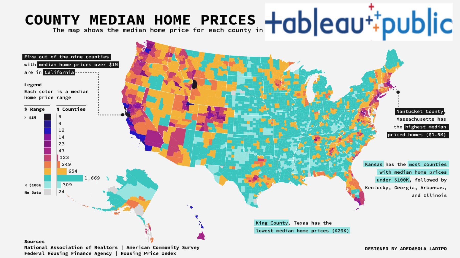
Tableau Public is the free version of Tableau’s mega-popular business intelligence software. It handles up to 15 million rows of data per workbook and builds complex, interactive dashboards suited to professional data analysis. You can author visualizations directly in your browser with Tableau Public’s web authoring, or use the free Tableau Public desktop app.
The drag-and-drop interface makes it relatively easy to get started, though the tool has a real learning curve. Building complex dashboards takes more time than with simpler tools, but produces more capable results.
The Catch
Everything you publish has to be public, which suits journalists, researchers, or anyone who wants to share their work publicly. Tableau’s own FAQ describes Tableau Public as a platform for sharing visualizations on the web, and a hidden viz remains reachable by anyone who has its direct link. Businesses working with sensitive or private data should choose a different tool.
The Tableau Public desktop app can save workbooks locally on your computer, and sharing them privately with a team requires a paid Tableau plan.
Perfect For
You’re doing serious data analysis and want to create professional, interactive dashboards. You don’t mind the world seeing your work, and you’re willing to invest some time learning the platform.
Summary
| Pros | Cons |
|---|---|
| Professional-grade tool with powerful features | All visualizations are public; limited private sharing |
| Excellent for complex data analysis and visualization | Steeper learning curve compared to simpler tools |
| Free for public use | Can sync to original datasource at most once per day |
Try Tableau Public if you are a data analyst, researcher, or journalist working with complex datasets and require advanced visualization capabilities.
Want something simpler that keeps your charts private? See our InstaCharts vs Tableau Public comparison.
Data Studio: The Data Dashboard King
Website Data Studio
Ideal For: Small to medium businesses, marketers, and analysts who need to create reports and dashboards, especially those already using Google products.
Cost: Data Studio is free. Data Studio Pro, the paid tier for teams, is $9 per user per Google Cloud project per month. The full BI platform, Looker, is $$$$
Naming note: Google renamed Data Studio to Looker Studio in 2022, then renamed it back to Data Studio in April 2026. If you’ve been searching for Looker Studio, this is the same product, and your existing reports, data sources, and shared links carry over automatically.
What Makes It Special
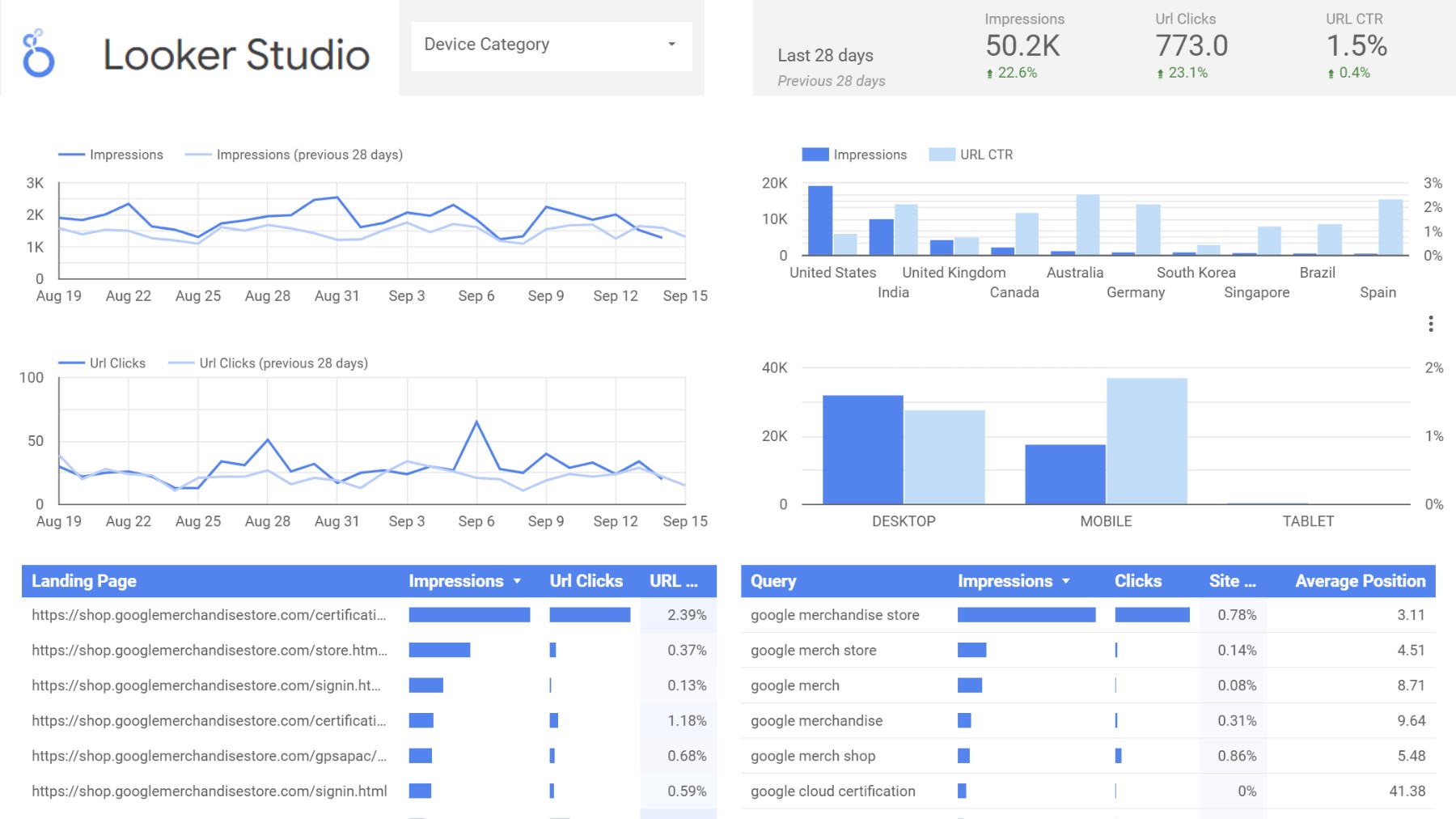
Data Studio is Google’s free business intelligence tool and includes many features typically found in paid platforms. Google positions it for personal data exploration and ad-hoc reporting, while Looker serves as the enterprise BI platform. Data Studio Pro adds team workspaces, organization-owned reports, and AI features for larger organizations.
Its built-in and partner connectors reach hundreds of data sources, including databases, marketing platforms, and cloud services, to create live dashboards that update automatically.
This means a dashboard updates automatically as your data changes, without manual updates or repeated CSV downloads.
The Catch
There’s definitely a learning curve, especially if you’re new to BI tools. Performance depends heavily on how well your data sources are optimized. It’s also less design-flexible than tools built specifically for beautiful visuals.
Perfect For
Businesses that need production-grade dashboards with live data connections. Marketing teams tracking campaign performance, operations teams monitoring metrics, or anyone who needs automated reporting.
Summary
| Pros | Cons |
|---|---|
| Free to use | Limited advanced customization options |
| Hundreds of data connections are available | Some users report performance issues with large datasets |
| Good for creating shareable reports and dashboards | Bit of a learning curve |
Use Data Studio for business intelligence, and creating shareable reports and dashboards.
InstaCharts: The Speed Runner
Website InstaCharts
Best For: Small to mid-sized businesses, bloggers, and anyone who needs “set it and forget it” live charts and dashboards.
Cost: Free, Starter for $10 user/mo, Pro for $19 user/mo. Paid plans are billed per seat.
What Makes It Special
Many chart makers require dragging and dropping data repeatedly before producing a usable chart. InstaCharts was built to simplify that process.
InstaCharts is built around simplicity and speed, making it a strong choice for quick data exploration and chart creation.
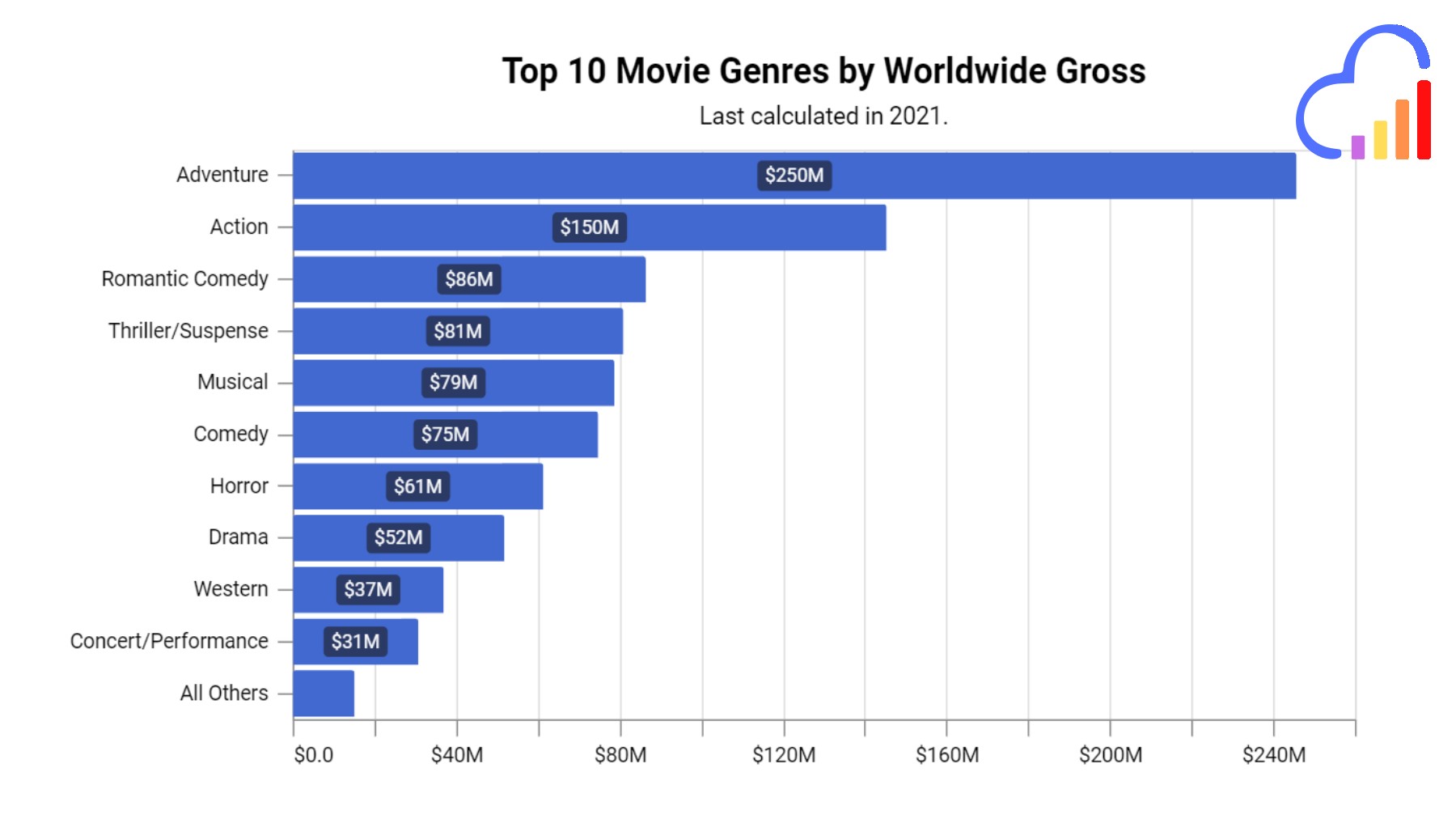
Paste your data and InstaCharts automatically suggests the best chart type, without requiring manual configuration of chart settings.
It syncs with Google Sheets and Google Drive, so your charts can update automatically when your data changes. Through Zapier, new rows from more than 8,000 apps can flow into a sheet and update its charts, and chart images can be sent to Slack, email, or Notion.
New for 2026: InstaCharts has dashboards. You can combine charts, data tables, KPI widgets and text widgets from multiple sheets into one live, shareable page, and free accounts can create private dashboards. If that sounds useful, check out the guide on how to create a dashboard.
The Catch
Customization is limited in exchange for speed, and charts are functional rather than highly stylized. Publication-ready or heavily customized charts require a different tool. Charts are drawn in high definition svg, so they can be imported into your favorite vector editing program for further refinement.
Perfect For
Data exploration (anything interesting in this spreadsheet?), internal reports, quick data checks, and anyone who values speed over full style control. Perfect for developers and analysts who need to generate charts for documentation or quick team updates.
Summary
| Pros | Cons |
|---|---|
| Fast and easy to use - appeals to non-technical users looking for no-code solutions | Limited customization options |
| A data first approach - good for quick data exploration and analysis | Basic chart types only |
| Live embedding - Paste a code snippet into your website and it stays updated forever | Integrations cover Google Sheets, Google Drive & Zapier at this time |
| Dashboards - combine charts, data tables, KPI and text widgets on one live page |
Choose InstaCharts if you want to immediately get and share a chart without fumbling around a BI platform.
Google Sheets: The Reliable Friend
Website Google Sheets
Best for: Teams who live in Google Workspace
Cost: Free with a Google account, or from $8.40/user/month for Google Workspace (Business Starter)
What Makes It Special
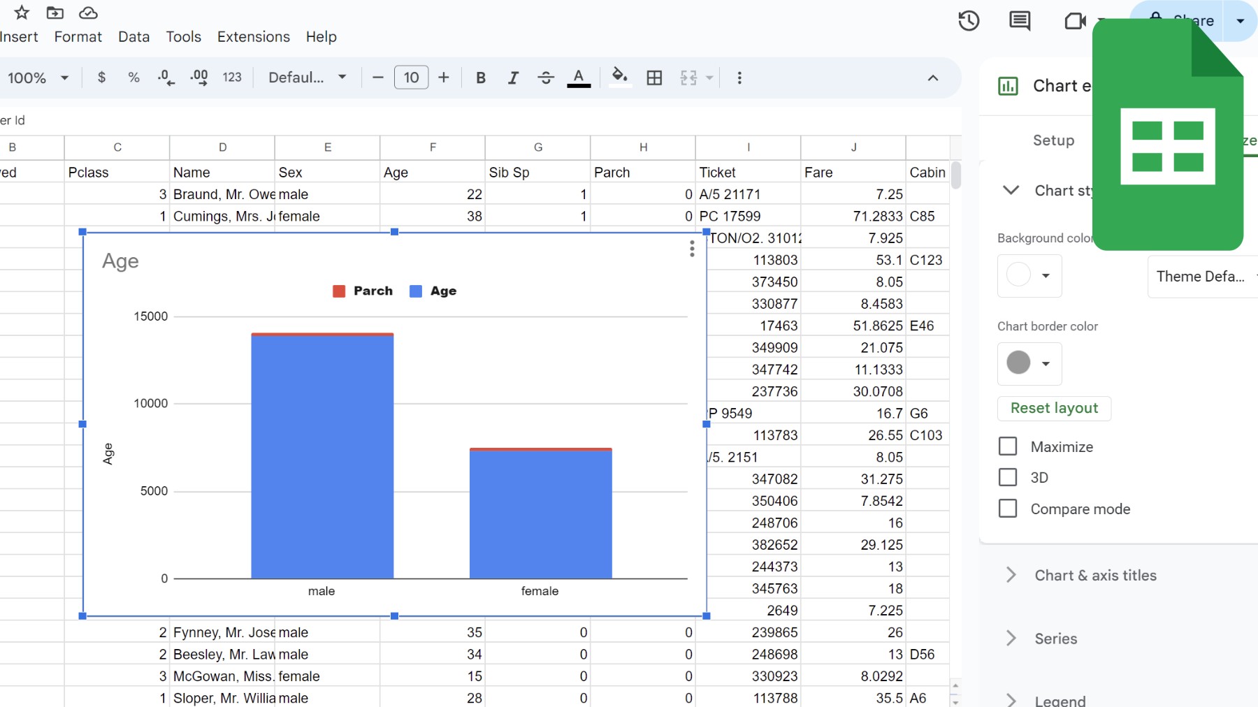
Google Sheets includes a chart maker built directly into the spreadsheet. Multiple people can edit the same spreadsheet and see charts update in real time, which makes it useful for team collaboration.
The chart editor is straightforward: select your data, click a button, and pick a chart type. The output is functional rather than highly designed, and charts are created quickly.
Gemini in Google Sheets adds a prompt-based way to build charts. You can ask it to add scorecards and bar charts above your sales data, and it can also create pivot tables, formulas, and formatted tables. Gemini in Sheets is available on eligible Google Workspace and Google AI plans, and it also runs in the Google Sheets app on Android.
The Catch
The charts are pretty basic. If you need something fancy or highly customized, you’ll bump up against the limits pretty quickly. Also, performance can get sluggish once you’re dealing with tens of thousands of rows.
Perfect For
You’re collaborating with a team, you need something quick and easy, and you’re already living in the Google ecosystem. Bonus points if you’re combining data from Google Forms or Google Analytics.
Summary
| Pros | Cons |
|---|---|
| Free to use with a Google account | Limited customization options compared to dedicated chart-making tools |
| Cloud-based, allowing for easy sharing and collaboration | Can be slow with large datasets |
| Variety of chart types available | Requires internet connection for full functionality |
| Real-time updates and syncing | Less suitable for complex or highly specialized visualizations |
| Familiar spreadsheet interface |
Choose Google Sheets for basic to intermediate visualization needs. It’s particularly useful for those already working within the Google ecosystem and for teams requiring collaborative charting capabilities.
Already using Sheets? See how to get better charts from it in our InstaCharts vs Google Sheets comparison.
Datawrapper: The Professional Editor
Website Datawrapper
Ideal For: Journalists, bloggers, and content creators who need to produce charts quickly without sacrificing quality. Ideal for online publications.
Cost: Free with a “Created with Datawrapper” attribution, Pro at $21 per user per month, Business at $39 per user per month, and custom pricing for Enterprise
What Makes It Special
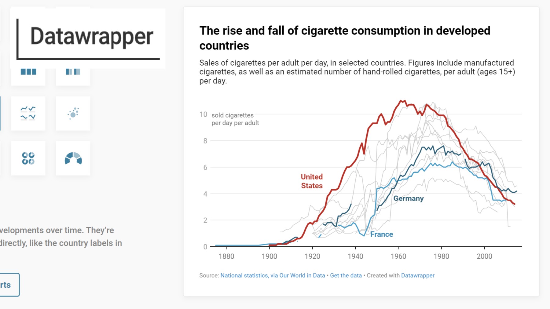
Datawrapper was built specifically for newsrooms. Charts created with it look polished, work well on mobile devices, and load quickly on web pages. The New York Times, The Guardian, Reuters, the Associated Press, and the UN all use it for published charts.
The interface is simple: upload your data, pick a chart type, customize it if needed, and publish. The full process takes just a few minutes once you’re familiar with the tool.
Datawrapper introduced new plans in July 2026. The free plan includes unlimited charts, maps, and tables with PNG export, and the attribution stays on published charts. Pro adds attribution removal, PDF and SVG export, and a 90-day edit history. Business adds waterfall and dual-axis charts, advanced team permissions, and a one-year edit history. Enterprise adds self-hosting, SAML single sign-on, and an account manager. Before July 2026, paid plans started at 10 user accounts, which made Datawrapper one of the more expensive options for individuals. The $21 Pro plan now places it in the same range as Flourish, Infogram, and Canva.
The Catch
Datawrapper is well suited for creating publication-ready charts, but less suited to exploratory data analysis. Datawrapper expects clean, pre-aggregated data: you generally upload only the columns you want to chart, already summarized in the exact shape you need. Because of that, its own guidance is to keep column charts to roughly 100 rows of categorical data or 300 rows of time-series data, and line charts to under 1,000 rows. If you want to slice, aggregate, or bin a larger raw dataset, you’ll need to prep it in another tool first.
Perfect For
This suits content created for publication, such as a news article, blog post, or report, where charts need to look professional by default and work reliably across devices.
Summary
| Pros | Cons |
|---|---|
| Quick to learn and use | Limited advanced customization options |
| Produces publication-ready charts | Free tier keeps the Datawrapper attribution and limits export to PNG; SVG and PDF export need a paid plan |
| Good for creating maps and location-based visualizations | Does not handle raw data automatically. Recommended to upload only the columns you want to chart, pre-aggregated in the format you’d like to chart in. |
Choose Datawrapper if you’re creating content for publication and need responsive charts that look great on different devices.
See a side-by-side breakdown in our InstaCharts vs Datawrapper comparison.
Flourish: The Storyteller
Website Flourish
Ideal For: Marketers, journalists, and data storytellers who want to create engaging, interactive visualizations without extensive technical knowledge.
Best for: Creating engaging, animated visualizations
Cost: Free, Presenter included with Canva Business at $25/month per user, Publisher and Enterprise with custom pricing
What Makes It Special
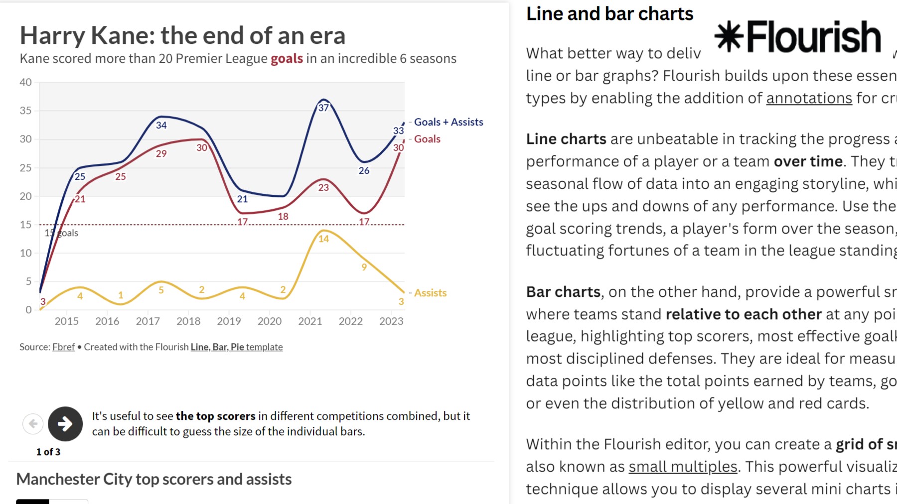
Flourish specializes in animated charts. It is the tool behind many of the bar chart race animations that became popular online, and it makes that animation style easy to create. The platform has over 50 templates for everything from simple line charts to complex scrollytelling narratives.
The animations are smooth and the interactivity is engaging. Flourish’s own guidance suggests looping, autoplaying stories as an alternative to GIFs when you need an animated visual for your website. It’s particularly great for showing change over time or guiding people through a data story.
Flourish was acquired by Canva in 2022, and it now lives inside the wider Canva ecosystem. Canva Business accounts include the Flourish app through the Presenter plan.
The Catch
You’re limited to the templates they provide. While they’re extensive and customizable, you can’t create completely custom visualizations from scratch. Pricing is worth a closer look too. The free plan includes unlimited projects and 50+ templates, but no image exports, and keeps the Flourish attribution on published work. The Presenter plan is bundled with Canva Business, which starts at $25/month per person, and adds SVG and image export options, attribution removal in Canva and PowerPoint, and PowerPoint embedding. Advanced capabilities sit higher up: team collaboration, website embedding without attribution, a custom branded theme, and live data updates from Google Sheets or CSV files come with the Publisher plan, which has custom pricing. Other chart makers offer these features at a lower price point (InstaCharts & Data Studio).
Perfect For
Content creators, social media managers, and educators who want to grab attention and tell compelling data stories. If you need your audience to actually watch and engage with your data, Flourish is your friend.
Summary
| Pros | Cons |
|---|---|
| User-friendly interface with powerful capabilities | Some advanced features require a paid subscription |
| Excellent for creating animated and interactive visualizations | Can be overwhelming with the number of options available |
| Good balance of simplicity and advanced features |
While some advanced features require a paid subscription, Flourish is user-friendly and excellent for creating animated and interactive visualizations, making it ideal for marketers, journalists, and data storytellers.
For a closer look at speed and features, read our InstaCharts vs Flourish comparison.
Visme: The Swiss Army Knife
Website Visme
Ideal For: Designers and marketers who need to create a variety of visual content, including charts and infographics, with a strong emphasis on aesthetics.
Cost: Free (limited), $29/month Starter, $59/month Pro
What Makes It Special
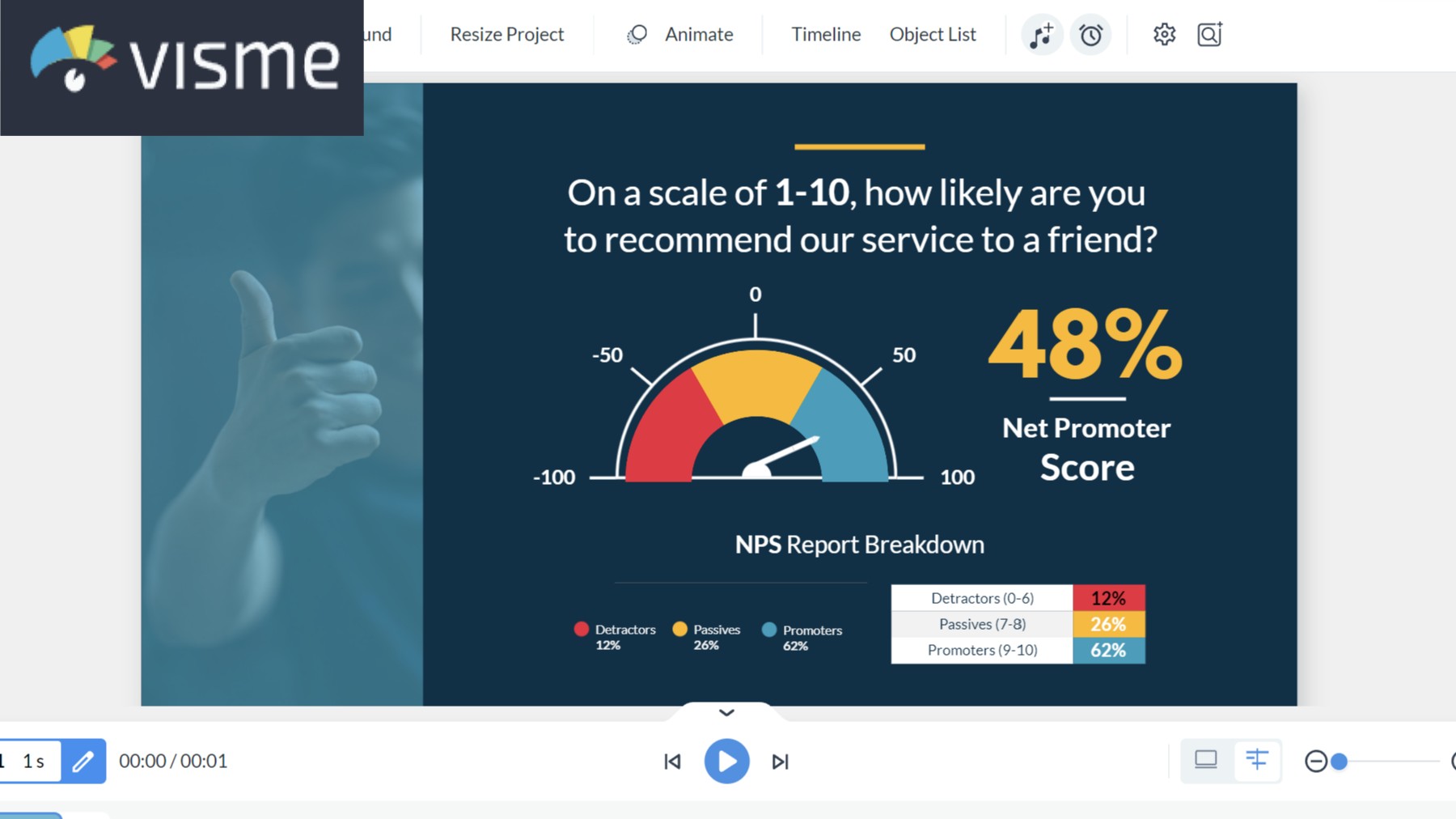
Visme is a visual content creation platform that includes chart making alongside presentations, documents, infographics, and social media graphics, all in one place. The AI Designer feature suggests layouts and designs.
The Brand Kit feature, included with the Pro plan, is particularly nice if you’re on a team. Set your colors, fonts, and logos once, and everything you create automatically stays on-brand. Starter includes 200 AI credits per month and Pro includes 500.
The Catch
The wide range of features creates a steeper learning curve, and the number of options can feel overwhelming at first. The charts themselves are solid, though dedicated chart tools offer more advanced visualization options.
Perfect For
Teams that need to create lots of different types of visual content while maintaining brand consistency. Great if you’re bouncing between creating presentations, social posts, and reports.
Summary
| Pros | Cons |
|---|---|
| Versatile tool for creating various types of visual content | Free version has limited features (like limited image exports) |
| Good balance of ease of use and customization options | Can be overkill if you only need simple charts |
| Strong design focus | Not for data exploration; need to preprocess data for charting |
Choose Visme if your focus is diverse visual content with consistent branding rather than analyzing data.
Infogram: The Marketing Pro
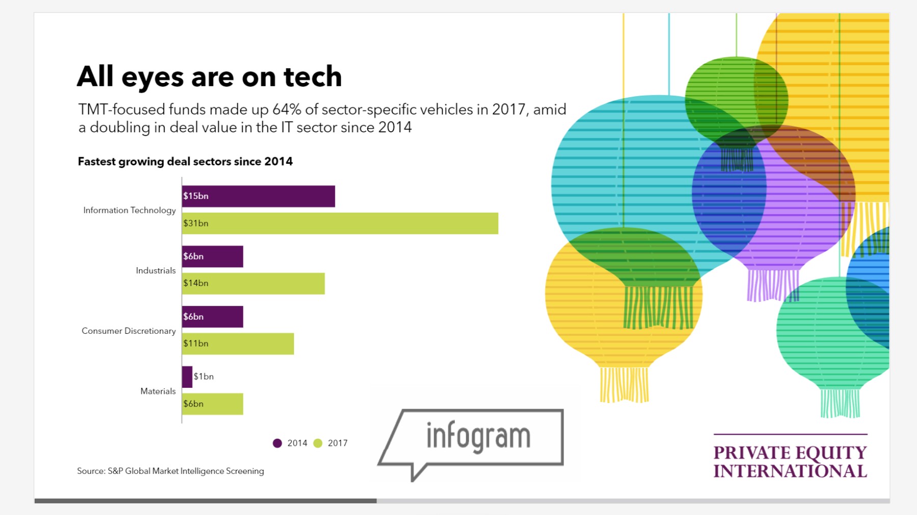
Website Infogram
Ideal For: Marketers, social media managers, and anyone needing to create visually appealing infographics and reports quickly.
Cost: Free (limited), Pro from $25/month
What Makes It Special
Infogram includes more than a million icons, images, and illustrations, plus more than 800 map types on paid plans, in addition to 35+ chart types. It’s designed for creating complete infographics that combine data visualization with design elements. The free plan allows up to 10 projects, and downloads become available with a paid plan.
The drag-and-drop editor makes it easy to create professional-looking content without any design skills. Plus, with brand kit features, you can ensure everything matches your company’s style guide.
The Catch
It works best for infographic-style content rather than a single quick chart. The interface can feel a bit busy compared to more focused tools, and some of the fancier features are locked behind higher-tier plans.
Perfect For
Marketing teams and social media managers who need to create eye-catching, branded content that combines data with design elements. Great for anyone who needs to make an impression.
Summary
| Pros | Cons |
|---|---|
| User-friendly, even for beginners | Advanced features and full customization require a paid plan |
| Great for creating visually appealing infographics | Some users find the interface cluttered |
| Good selection of charts and graphs | Visualizations in free tier are not private |
| Branding | Need to preprocess your data for charting - no data transforms |
Choose Infogram if you are creating branded infographics and already know what your chart will look like.
Canva: The People’s Champion
Website Canva
Ideal For: Marketers, small business owners, and non-designers who want to create visually appealing charts and infographics as part of broader design projects.
Cost: Free (limited), $18/month Pro
What Makes It Special
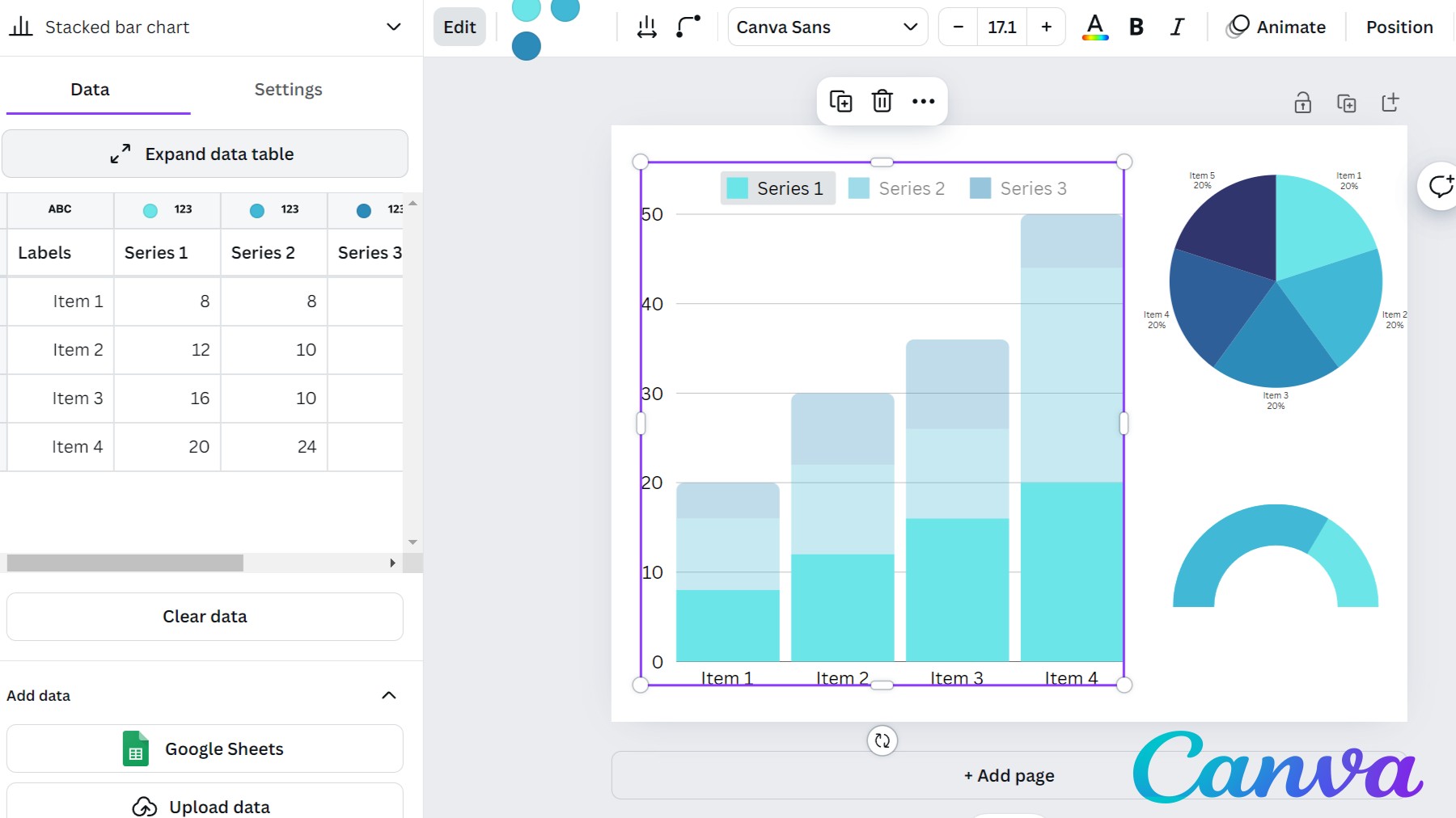
Canva has expanded from a design tool into a full content creation platform. Canva Sheets includes Magic Charts, which build charts from your data and stay in sync with the spreadsheet as the data changes, so chart-building expertise is optional.
Charts integrate directly with Canva’s other features, so a chart can be added to a presentation, social media post, or infographic without leaving the platform, and everything can match your brand style automatically.
The Catch
Canva is not built for data analysis. Large datasets or calculations on the data need to be handled in another tool first. Canva also limits chart data to 1,000 rows and 100 columns per sheet, so larger datasets need to be trimmed down before they’ll fit. For simple, design-focused needs, Canva works well.
Perfect For
Social media managers, small business owners, teachers, and anyone who needs good-looking visualizations without learning complex software. Canva makes chart creation as simple as creating a social media post.
Summary
| Pros | Cons |
|---|---|
| Very user-friendly | Limited advanced chart customization options |
| Excellent for creating visually appealing designs that incorporate charts | Not ideal for data analysis - presentation only |
| Vast library of design elements and templates |
Choose Canva if you’re a non-designer who wants pretty charts and you already know what the chart will look like.
If the data matters more than the design, compare them in our InstaCharts vs Canva comparison.
Which Chart Maker Should You Choose?
There is no single best chart maker. The right choice depends on what you’re trying to do.
Here’s my quick decision tree:
Need it fast and don’t care about fancy features? → InstaCharts or Google Sheets
Creating content for publication? → Datawrapper for static/simple, Flourish for animated/interactive
Making social media content? → Canva (easy) or Infogram (more features)
Need serious data analysis? → Tableau Public (if public is okay) or Data Studio (for live dashboards)
Want a live dashboard without learning a BI tool? → InstaCharts (here’s how)
Creating diverse branded content? → Visme (all-in-one) or Canva (easiest)
Already living in Google Workspace? → Google Sheets or Data Studio
Final Thoughts
Making good charts depends on the tool as well as an understanding of your data and your audience, and having the right tool helps. Start with one of the easier options, such as Google Sheets, Canva, or InstaCharts, and once you bump up against its limits, you’ll have a better sense of which features matter to you.
The best chart maker is the one that gets used consistently. A simple, clear chart made in Google Sheets is more useful than a complex visualization that never gets finished.
Happy charting! 📊