
Chart maker
Scatter Plot Maker
Find correlations between two variables
A scatter plot places a dot for every row on a two-axis grid, so the pattern of points reveals whether two numeric variables are related and where the outliers sit. InstaCharts is a free scatter plot maker that builds it straight from your spreadsheet.
A live scatter plot example
An interactive scatter plot built and embedded with InstaCharts.
Your data
What data you need for a scatter plot
Paste your spreadsheet, upload a CSV or Excel file, or connect a Google Sheet, and InstaCharts detects your column types and builds the scatter plot automatically.
X-Axis
Numerical values, the independent variable
Y-Axis
Numerical values, the dependent variable
Use cases
When to use a scatter plot
Best uses
- See whether two numeric variables move together or apart
- Spot outliers far from the main cluster
- Explore relationships before statistical modeling
- Reveal where data points concentrate by density
When another chart fits better
- A categorical axis belongs in a bar chart
- Trends over time read better as a line graph
- Very dense data overplots; add a category or use a heatmap
How it works
How to make a scatter plot
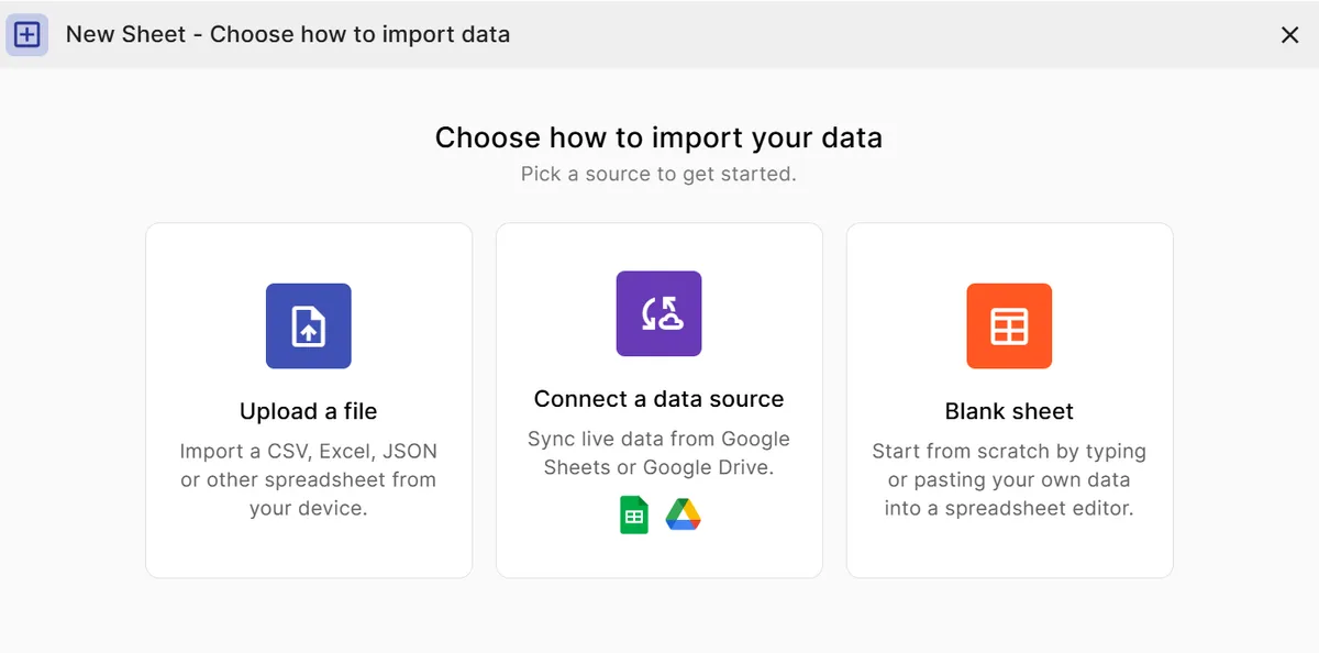
Step 1
Add your data
Paste a spreadsheet, or upload a CSV, Excel, TSV, or JSON file.
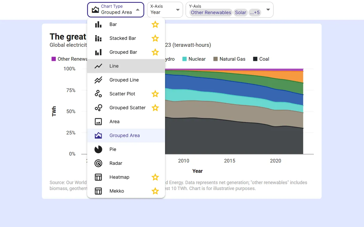
Step 2
Pick the scatter plot
InstaCharts auto-suggests a chart; switch to this type in one click.
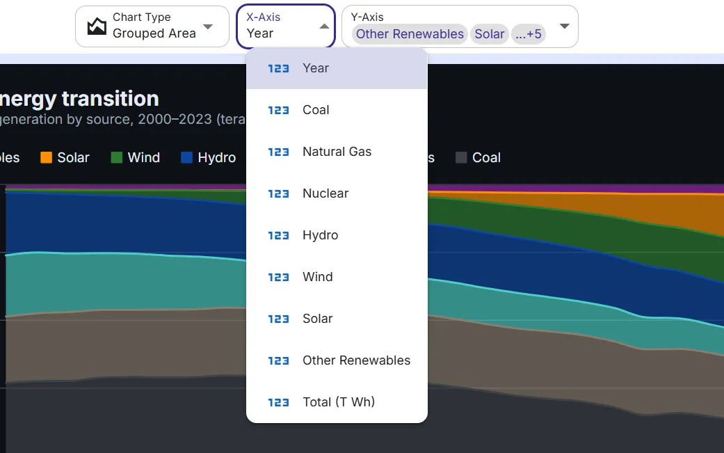
Step 3
Map your columns
Choose which columns drive each axis, or accept the smart defaults.
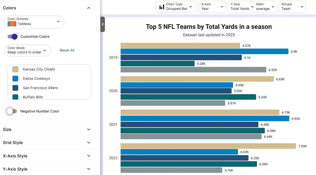
Step 4
Customize styling
Adjust colors, labels, and titles to match your brand or report.
Step 5
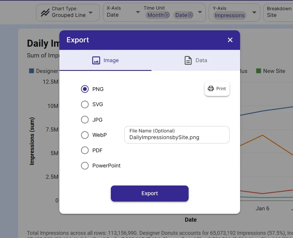
Export or embed
Download as PNG, SVG, or PDF, share a link, or embed a live, auto-updating chart.
FAQ
Scatter Plot maker FAQ
Answers to common questions about making a scatter plot with InstaCharts.
Is the scatter plot maker free?
Yes. Creating and exporting a scatter plot is free with no account. The free tier supports up to 500 rows and adds a watermark; paid plans from $10 user/mo remove it.
What data do I need for a scatter plot?
Two numeric columns, one for the X-axis and one for the Y-axis, with each row becoming a point. Paste it in, upload a file, or connect a Google Sheet.
Can I color points by a category?
Yes. Add a breakdown column and InstaCharts turns it into a grouped scatter plot, coloring points by category so you can compare relationships across groups.
Can a scatter plot handle large datasets?
Yes. InstaCharts is built for full spreadsheets, and when points overplot you can filter, color by category, or switch to a heatmap to keep patterns visible.
Want the full reference?
Read the scatter plot documentation.
Explore
Related chart makers
Compare related chart types, or browse every InstaCharts chart maker below.
Grouped Scatter Plot Maker
Compare correlations across groups
Heatmap Maker
Reveal patterns across a data grid
Line Graph Maker
Plot trends over time online
All InstaCharts chart makers
- Bar Chart Maker
- Stacked Bar Chart Maker
- Grouped Bar Chart Maker
- Line Graph Maker
- Grouped Line Chart Maker
- Area Chart Maker
- Grouped Area Chart Maker
- Pie Chart Maker
- Grouped Scatter Plot Maker
- Radar Chart Maker
- Heatmap Maker
- Mekko Chart Maker
- Gauge Chart Maker
- Grouped Gauge Chart Maker
- Donut Chart Maker
- Waterfall Chart Maker
- Horizontal Bar Chart Maker
- 100% Stacked Bar Chart Maker
- 100% Stacked Area Chart Maker
- Trend Line Graph Maker
- Pie Chart Maker with Percentages
- Semi Circle Pie Chart Maker
- Likert Scale Chart Maker
- Survey Chart Maker
- Cash Flow Waterfall Chart Maker
- Budget vs Actual Chart Maker
See every option on the chart maker page.
Make your scatter plot in seconds
InstaCharts makes data visualization easy, so you can build clear reports without design experience.